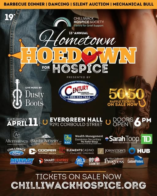
Chilliwack – from RAN Media Release: Fresh look, same heart.We’re excited to introduce our NEW logo!
Our new design features a vibrant orange and grey palette—orange symbolizes hope and optimism, while grey represents resilience and strength, reflecting the balance we strive to bring to our community every day.
It’s brought to life by a sprout – a meaningful symbol of new beginnings and the seeds of change we plant in the lives of those we serve. It’s a reminder that even the smallest start can grow into something extraordinary.
We’re also embracing our full name—Ruth & Naomi’s—to reflect the compassion and connection at the core of our work.
This new chapter is a celebration of where we’ve been and where we’re headed, and we can’t wait to continue to grow alongside our community.
Designed in partnership with our friends at We are the Northern (our trusted Marketing Agency that continuously works to captured the heart of who we are).